
Originally published on uxcollective.cc Play with the interactive Prioritisation Tool
We want to test countless areas in our designs because we just can’t wait to verify our assumptions. We look forward to testing with users so that we can improve the designs. We can’t wait to make those corrections that we so desperately want to make. And we can’t wait to settle the bet we had with the Visual Designer or with the Product manager!
We’ve all been there. In our minds, user testing will be the judge of all so it’s tempting to stuff as many research questions as we can into a test plan and put in as many tasks/scenarios as possible for the user. This creates problems:
- Time is money — users are paid for their time (normally hourly) and going over budget is not good. Users will get tired when they have to spend unnaturally long periods of time thinking out loud. Whilst there’s no consensus on how long user test sessions should be, in the world of teaching, teachers normally plan classes for between 30–50 minutes.
- Quality is always more important than quantity in “formative evaluations” — users' time is better spent giving detailed qualitative information that can be used to improve designs. General and vague statements are not enough.
- Large complex prototypes are more time consuming to build so it may be better to get feedback early and quickly so that you can iterate and test again. As you can see from how Netflix designed their website, faster failing leads to more experimentations so that you learn quickly.
So if this happens to you frequently, what is the best way to prioritise? How do you make the test focused on what’s important to yourself, your users and your company?
It goes without saying that there is no definitive answer because you can always ask your boss and everyone on your team, but it’s not going to be easy to build consensus because everyone is likely to have their own interests in mind.
I’m going to share with you a little tool that I use in work and when I freelance which makes it much easier to prioritise competing research questions/test objectives. It’s called a prioritisation grid and I originally found it in Richard N Bolles’s “What Color is your parachute?”.
It works like this:
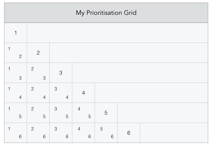
First you use a prioritisation grid template like the one below. I know it might look scary and complicated but don’t worry because it’s actually very easy to use and I will guide you step by step on how to use it. Note that you can use this method with your team or just on your own.
In this example, I’ve only included 6 competing research questions to make things easier but when you use it in real situations, you can have as many questions as you want, you just have to increase the number of rows and columns.
After each number, you write down your research question. For example in my grid, research question 1 is “Are the landing page modules easy to understand?”.
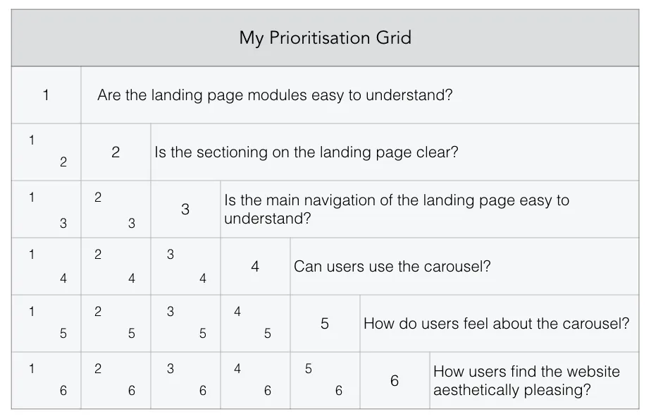
Once you’ve done that, you’re a third of the way there. The next thing we are going to do is compare each research question with another one starting with 1 and 2. When we have decided, we are going to circle the number.
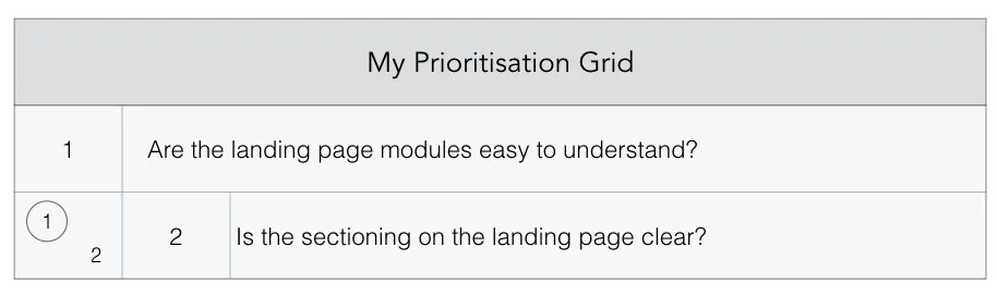
What I’ve done here is ask myself or my team:
“If I/we could only test either research question 1 or research question 2, which would I/we pick?”
You will then go down each row and compare research question 1 with each and every other question. In the end you will get something like this:

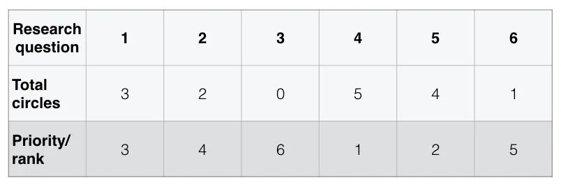
Okay, now we’re 85% there. All we have to do is total up how many circles we have for each research question. We will go through each cell where we have compared questions and count. We can record the results by filling out this mini-table:
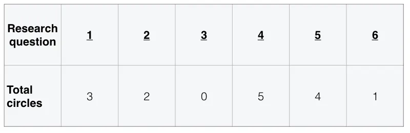
This might seemed tricky to me at first because I just counted downwards but it doesn’t work like that. For example, there are a total of five circles for research question 4 because there are 3 circles in row four and 2 circles in column 4.
To check that you have counted correctly, the totals should go from 0 to n where n-1 is the number of research questions you have i.e. 0, 1, 2, 3, 4, 5 in my example.
Thankfully the last step is the easiest. Whichever research question has the most circles is assigned the highest rank and the question with no circles is assigned the lowest rank. This way an ordering system naturally appears.
In my experience, this little grid has worked well not only for User testing but in any area of life where prioritisation is difficult. Once you get the jist of it, it is a simple and easy to use tool.
To make things even more exciting, I've created a simplified electronic version for you!
Check it out here and please enjoy! Prioritisation Grid Tool